bcCBar3: Colour Scalebar for One-Band Rasters 
V3.5 - 11 September 2020
This QGIS Processing algorithm creates a colour scalebar image file (svg and, optionally, png*) for a coloured 1-band raster. Use the created colour scalebar as legend in print composer.
Distributed under the GPL licence
This algorithm works only on QGIS version 3.x.
It is NOT backward compatible with old .qml formats generated with QGIS versions ≤ 2.99
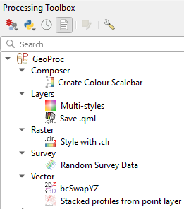
This algorithm is part of the Processing geoprocAlgos plugin. Once installed the geoprocAlgos plugin can be found in the 'Processing toolbox'.
Please report any bug/problem/wish on GitHub or, not recommended, to the QGIS User mailing list [mailto: qgis - user at lists dot osgeo dot org].
Contents
Installation
Be aware that this algorithm requires extra pyton modules (numpy, matplotlib, pillow, beautifulsoup & lxml).
numpy & matplotlib should be installed with your QGIS installation, but pillow, beautifulsoup & lxml could require manual installation. They can be "pip install" from the QGIS command line (pip install pillow for pillow, pip install bs4 for beautifulsoup & pip install lxml for lxml).
For Windows users, another option is to install from 'wheels' from Christoph Gohlke's very resourceful site.
Minimum modules version required to run this algorithm:
- numpy: >= V1.16.3
- matplotlib >= V3.0.0
- pillow >= V5.3.0
- beautifulsoup >= V4.7.1
See here for installation instruction.
Once successfully installed the algorithm is found in the Processing toolbox under GeoProc -> composer -> Create Colour Scalebar:
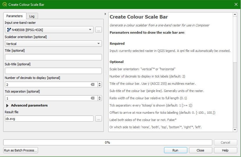
Double-click "Create Colour Scalebar" to launch the configuration window:
Anatomy of a colour scalebar
A colour scalebar is made of the following elements:

Each element can be customised through optional parameters.
Parameters
Many options are available to customise the generated colour scalebar! But they are all optional and a default value is provided. Note that those default values are not optimum at all and fine tuning will be necessary...
The only required parameter is a 1-band raster in input, which has already been styled. If you select a raster layer in QGIS legend before running this algorithm then it is automatically set as input. The raster must be a styled one-band raster otherwise the algorithm will fail.
By default the algorithm produces a vertical colour scalebar with ticks and labels for each value of the raster colours located on the right side of the scalebar.
Most used parameters: (see figure above)
- Input one-band raster
- The currently selected raster layer in the QGIS legend. Or select another raster layer present in the QGIS legend. Selecting a raster from a file is not supported unless it has an associated qml sidecar (i.e. a file with the exact same name as the raster but with extension .qml in the same directory as the raster).
- Scalebar orientation
- "vertical"* or "horizontal"
- Title
- A title for the colour scalebar. Use ÿ (ASCII 255) as a multiline marker. E.g.:
SRTM tile NW234
- Sub-title
- Sub-title of the colour scalebar (single line). Generally units of the raster. E.g.
Elevation (m)
- Number of decimals to display
- Number of decimals to display for the tick labels (default: 2). E.g.
125.00
- Tick separation
- Every 'ticksep' is shown (default: 1 [≥ 1]). E.g.
if set to 5, every 5 colour labels will be shown.
Advanced parameters: (see figure below)
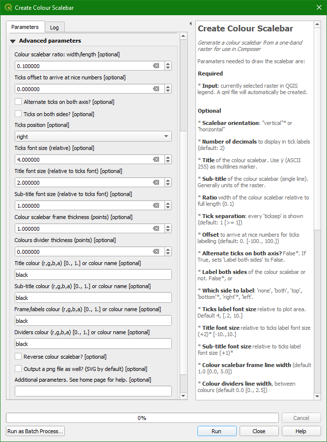
- Ratio width/length
- Ratio of the width of the colour scalebar relative to its full length (default: 0.1 [10%])
- Number offset
- A relative offset to arrive at nice numbers for ticks labelling (default: 0. [-100., 100.]).
E.g. original ticks position at are 134 154 174... With an -4 offset the ticks will be located and labelled at 130 150 170...
- Alternate ticks on both axis?
- Do the tick labels alternate between the two axis? False*. If True the "Label both sides" setting is ignored. Check this setting to declutter the labels if they overlap each other. This is an alternative to increasing 'Tick separation' and/or decreasing font size.

- Label both sides
- Do you want label both sides of the colour scalebar or not? False* (only one side or none, see below)
- Ticks side
- Or, on which side of the colour scalebar the ticks will be located: 'none', 'both', 'top', 'bottom'*, 'right'*, 'left'. Valid values depend on the orientation of the colour scalebar.
- Font sizes
- Ticks label font size relative to plot area. The font size is relative and not in current units (pt or px). Default 4, [0.2, 10.]
- Title font size relative to ticks label font size, i.e. an offset relative to the ticks label font size. Default +2 [-10.,10.]
- Sub-title font size relative to ticks label font size, i.e. an offset relative to the ticks label font size. Default +1 [-10.,10.]
- Line widths
- Colour scalebar frame line width. Default 1.0 [0.0, 5.0]
- Dividers line width, between colours. Default 0.0 [0., 2.5]
- Colours
- Title colour: a valid colour name or a (r,g,b,a) list of numers between [0., 1.]. ('black'*). E.g.
[0.,1.,0.,1.] for green
- Sub-title colour: a valid colour name or a (r,g,b,a) list of numers between [0., 1.]. ('black'*). E.g.
(1., .5, .5, 1.) for light red
- Frame colour: a valid colour name or a (r,g,b,a) list of numers between [0., 1.]. ('black'*). E.g.
'red'
- Divider colour: a valid colour name or a (r,g,b,a) list of numers between [0., 1.]. ('black'*). E.g.
'blue'
- Other options
- The scalebar can be reversed. False*
- A png (see note) file can be created in addition to the svg file. False*
- Additional parameters
- It is also possible to more completely define the fonts used for title, sub-title and label using a python dictionary structure. See the section Extra parameters below for details.
- Ouptut
- The name of the svg file representing the generated colour scalebar. The base name (without extension) will be used to generate a filename for the report and for the optional png file. If left empty (default) the name will be random and the files will be located in your Processing temp directory.
* is the default value for that parameter
Extra parameters
Those parameters are formatted as a python dictionary, so the general format is
{'Parameter_name':value, 'parameter_name':value, ...}
Parameter_name can be any of:
'title_align':
Title text alignment: one of 'center'*, 'right' or 'left''units_align':
Sub-title text alignment one of 'center'*, 'right' or 'left''ticks_font_properties':
A python dictionary of valid font properties for ticks label {}* - see below'title_font_properties':
A python dictionary of valid font properties for title {}* - see below'units_font_properties':
A python dictionary of valid font properties for sub-title {}* - see below'mathfont_set':
The font-set use for displaying mathtext, one of: 'dejavusans'*, 'dejavuserif', 'cm' (computer modern), 'stix' or 'stixsans'
Note that alignments of title and sub-title are made relative to the colour scalebar frame. The ticks label widths are not taken into consideration! It is then best to use those parmeters only for horizontal scalebars.
* is the default value for that parameter
The font dictionary can have the following keys: 'family' and 'size'. Note that the values ('style', 'variant', 'stretch' and 'weight') cannot be set in Matplotlib with a font name defined in the font dictionary.
Accepted values for each key are:
'family': a valid font name (e.g. Arial) or a generic font name (e.g. sans-serif). Several font names are separated with coma and the one used is the first valid one found from the left of the string.'size': one of 'xx-small', 'x-small', 'small', 'medium', 'large', 'x-large', 'xx-large' or a number between [0, 100]
Examples
{'units_align':'left'} to align the sub-title to the left of the colour scalebar.{'title_font_properties':{'family':'venetia,sans-serif', 'size':40}} to set the title font to venetia (or sans-serif if venetia is not found) with a font size of 40 points.{'mathfont_set':'stix'} to use the STIX math font to write mathematical expression. For more information see Matplotlib tutorial Writing mathematical expressions.
Results
On completion, a svg file, a report file (html) and optionally a png file are created. If all is ok a screen similar to the one below is shown:
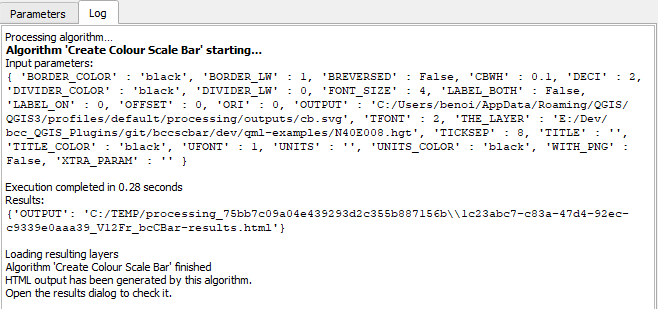
and the report is available in Processing results pane:
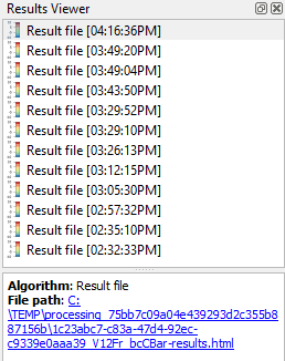
Click on the "File path" link to open the report. This report shows the generated colour scalebar(s) as well as the location of the generated file(s) and a list of the parameters used. A standard suffix is added to the name of the file (e.g. _H12Tt. See below for an explanation). See example report here.
To import the colour scalebar into QGIS Composer do as follows:
- From the report, right-click the 'Source' link and click 'Copy link location' or similar
- In Composer, select the image object
 and draw a frame on the canvas.
- Click in the "Image source" box and then Ctrl-V (or right-click & Paste) and hit Enter
- The colour scalebar is displayed
- Resize it to your liking and it is done!
Standard suffix
This is a 7 character string appended to the name of the colour scalebar and the meaning of each character is as follows:
- _: separator
- H or V: for horizontal and vertical respectively
- number: Colour interpolation: 0: discrete, 1: linear, 2: exact and 3: paletted
- number: Colour mode: 1: Continuous, 2: Equal interval, 3: Quantile
- T or F: annotate labels in alternance between both sides of the scalebar (T) or not (F)
- T or F: annotate both sides of the scalebar (T) or not (F)
- letter: tick position: one of n (none), l (left), r (right), t(top) or b (bottom)
Notes
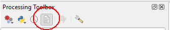
- If the Processing results pane is not shown, you can open it from the Processing toolbox menu bar:
- If default output is used, then the svg, html and optionally the png files are created in Processing temporary directory. This means that on closing QGIS that directory is deleted and all files within it. If you want to keep the svg file, either give an output name or copy the content of the Processing directory somewhere else before closing QGIS.
- PNG:
“It is known that some vector graphics viewers (svg and pdf) renders white gaps between segments of the colorbar. This is due to bugs in the viewers, not Matplotlib.”
source: matplotlib documentation.
It is unfortunately true for rendered colour scalebars in svg. If this is a problem, you can also generate a png file that will not have those pesky white lines... Simply check the box "Output a png file as well? (SVG by default)".
Change log
- 3.5: Fix missing module.
- 3.4: Fix problem with svg creation.
- 3.3: Fixed custom font disctionary bugs. Font limitations: only font names and sizes can be set in custom dictionary.
- 3.2: Add 'alternate ticks' option. Make sure that both ends of the colour bar are labelled.
- 3.1: Fixed bugs.
- 3.0: Brand new refactory and switch to Processing lgorithm.
Algorithm now available as part of the geoprocAlgos plugin.
Requires external python modules.
- 0.12.2: WindowDressing: Changed company name.
- 0.12.1: Fixed: Error - missing resources_rc when installing.
- 0.12.0: Fixed: An empty title creates an image cut at the top (reported 2015/12/19).
- 0.11.0: Remove temporary file(s) when not needed anymore.
Plugin no longer available from the Geoproc repository.
- 0.10.0: Add some logic on selection/deselection of current raster.
Tweak ui for beter rendering on different os'es.
- 0.9.0: Add an option to use the colour ramp of the selected one-band raster instead of having to select a file.
- 0.8.0: Fix problem where UI was irresponsive (nothing happened when a button was clicked).
- 0.7.0: Recompile the UI and add internationalisation in the hope that reported problem is fixed.
- 0.6.0: Compatibility with QGIS version 2.x
Can read .qml files from both QGIS versions 2.x and 1.x
- 0.5.1: Contribution from Thomas Wahlmüller.
A summary of the changes:
discrete styles
==========
same as before, no code changed
only function name renamed, to better distingunish between the
functions of other annotations
interpolated
========
interpolation is done in "cdlgSCBR.py"
annotion is different to discrete (at least 2 ticks at minimum and
maximum, more ticks are spread equaly)
exact
====
annotation is in the middle of the color, also the height/width of
the bar is set according to annotation
a border is drawn around every element
horizontal bar: minimum box width is maximum annotation length
vertical bar: minimum box height is annotation height
Thanks Thomas!
- 0.4.1: Title font is now linked to the selected label font.
- 0.4.0: Add the 'Select output directory' button. Remember the last directory used for output and the last directory used for palette selection.
- 0.3.1: Correct visual interface glitches on Ubuntu.
- 0.3.0: Changed button text from (*.tbl) to (*.txt) and removed 'pressed' signal trapping.
- 0.2.0: Changed deprecated call to current call in plugin initialisation.
- 0.1.0: Correct a bug preventing plugin removal from the plugin menu.
- 0.0.1: Original published.
Published date: 12 Jun 2019.

